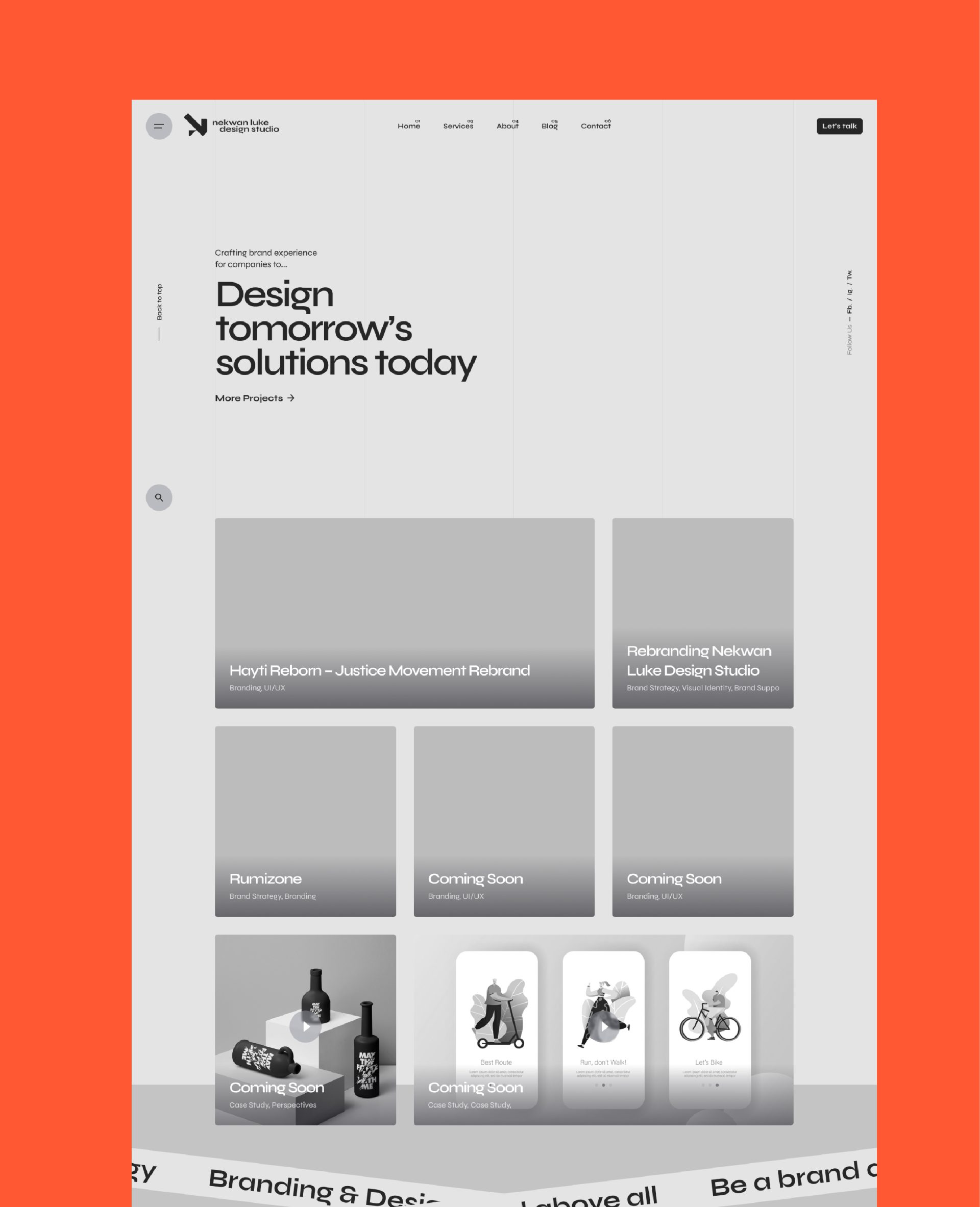
Rebranding Nekwan Luke Design Studio
Aligning Identity With Core Values & Ambitions
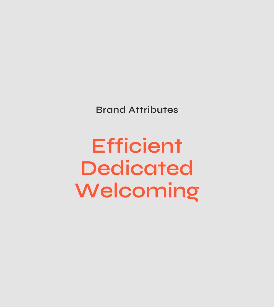
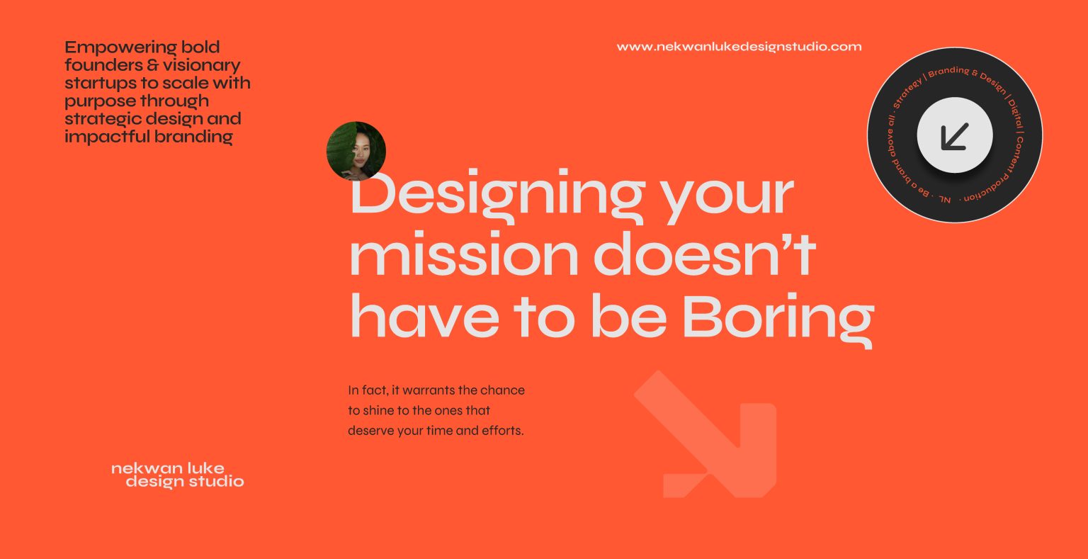
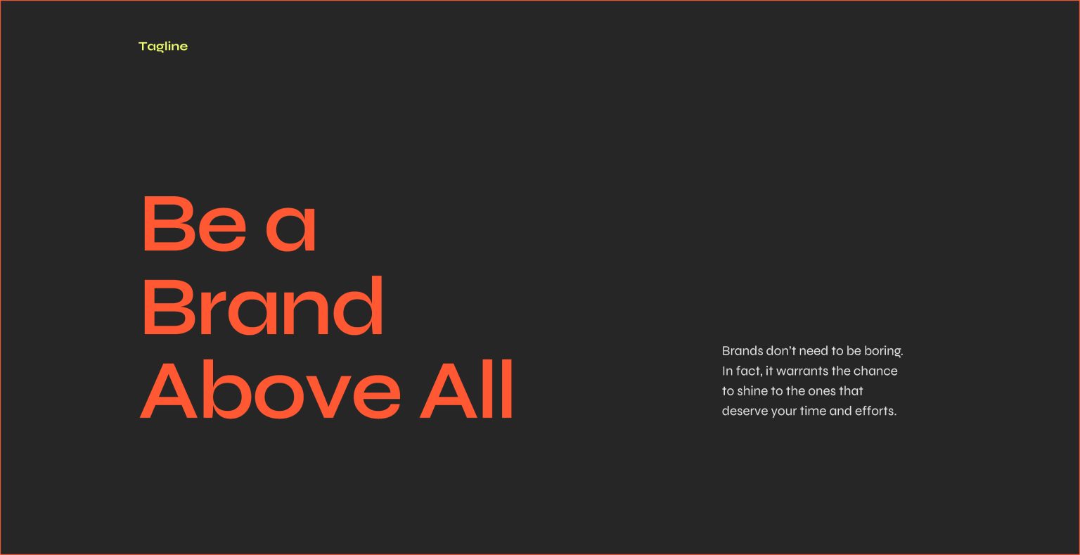
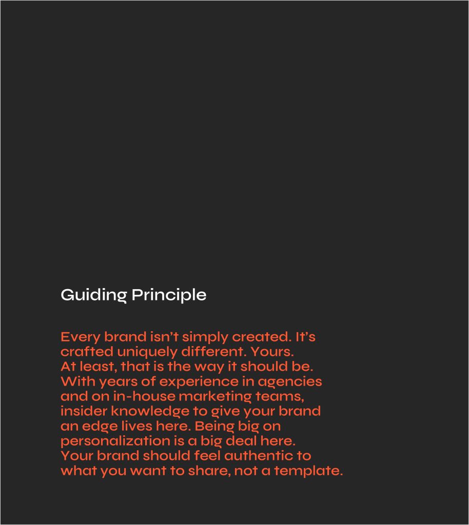
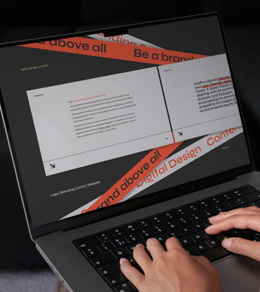
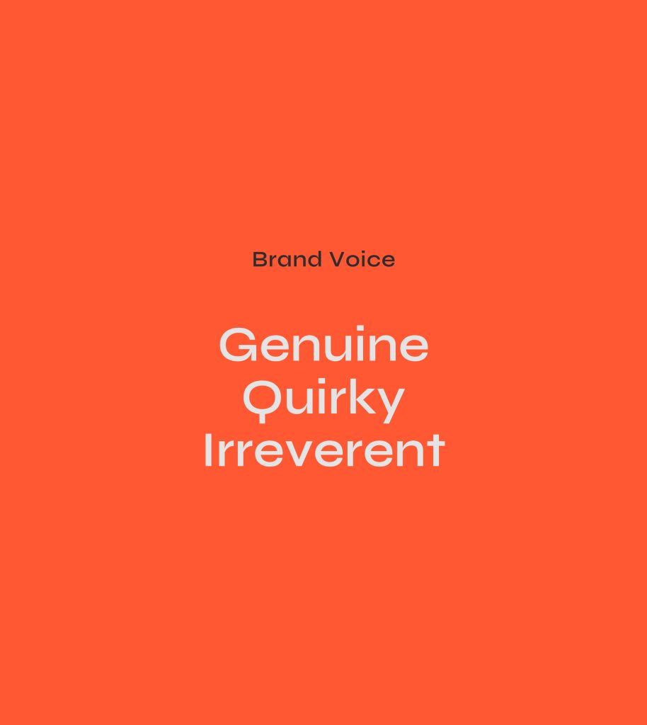
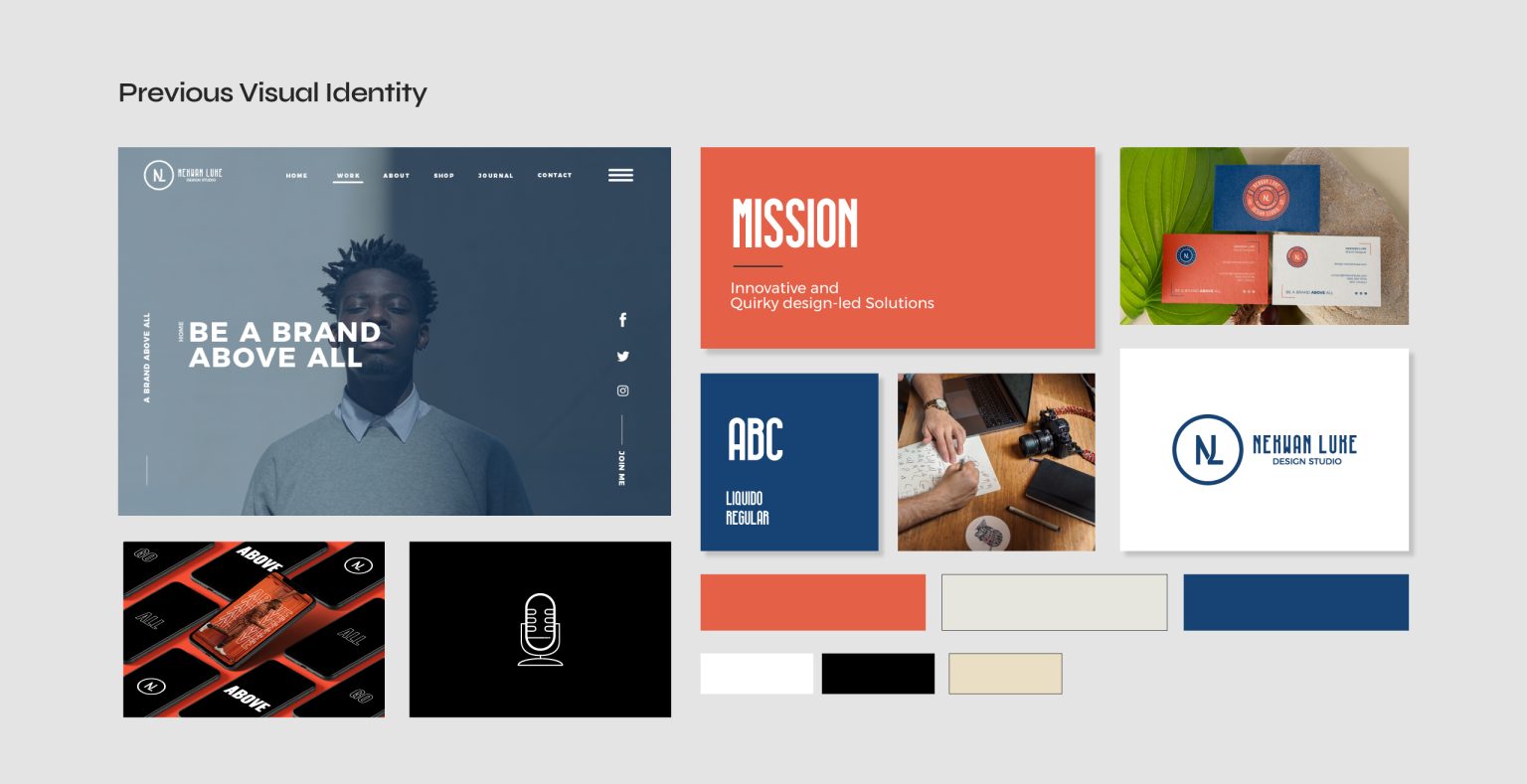
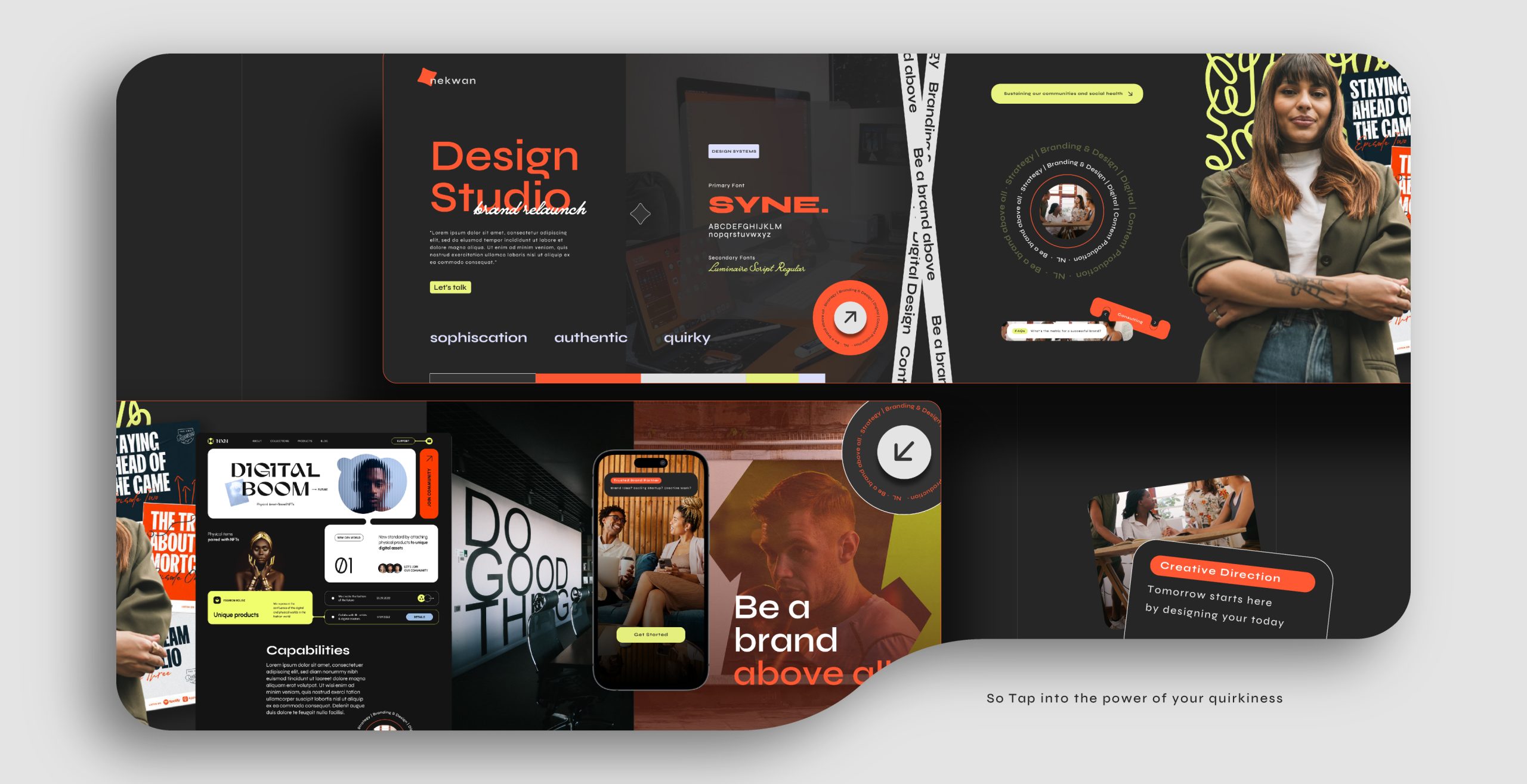
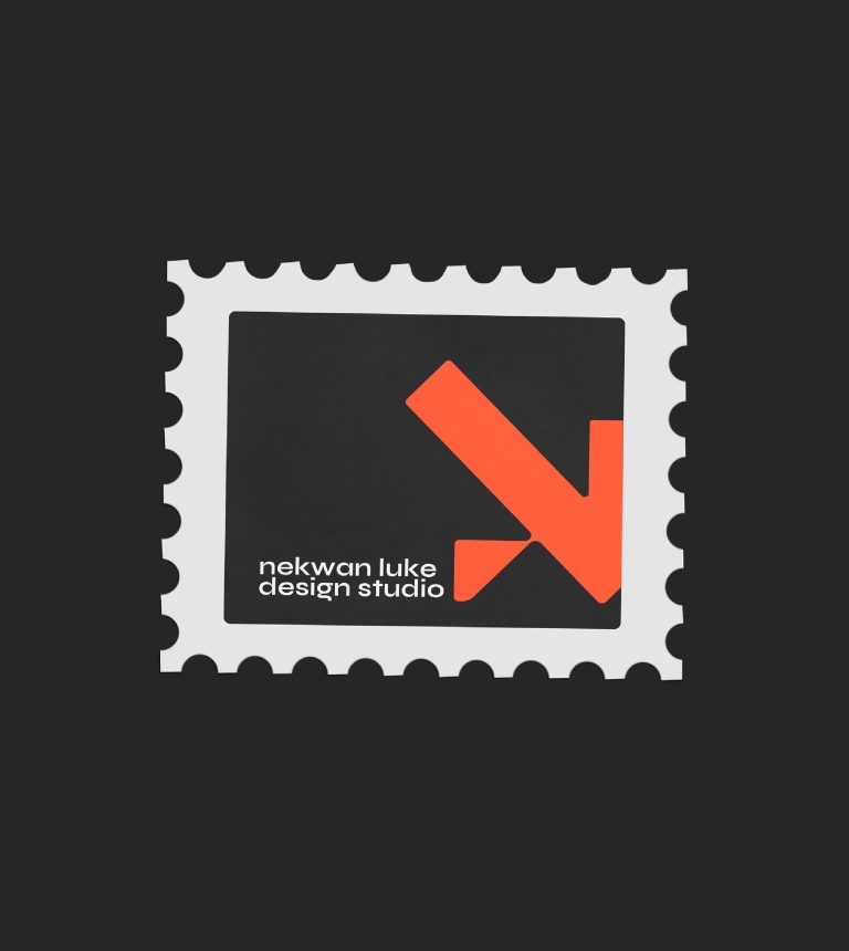
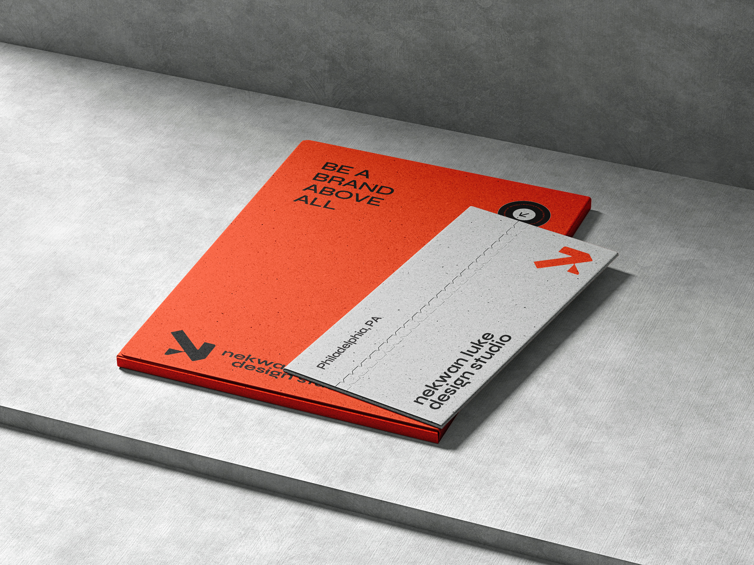
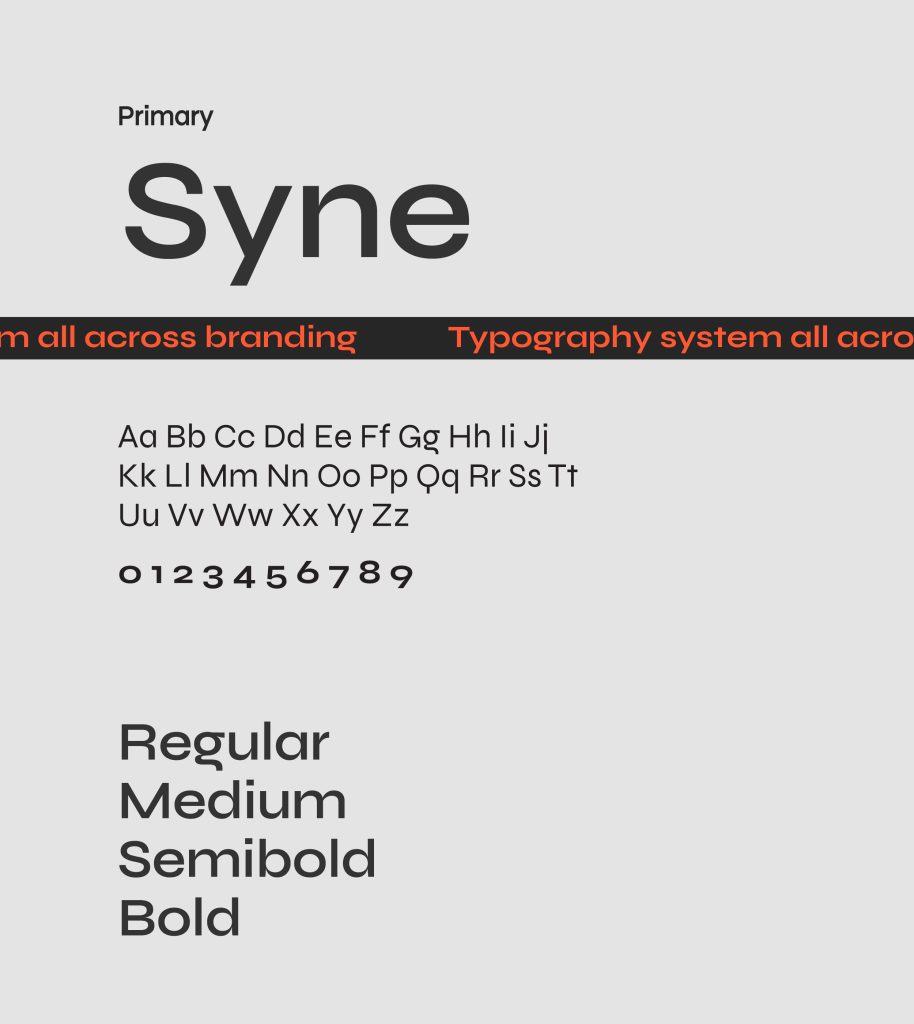
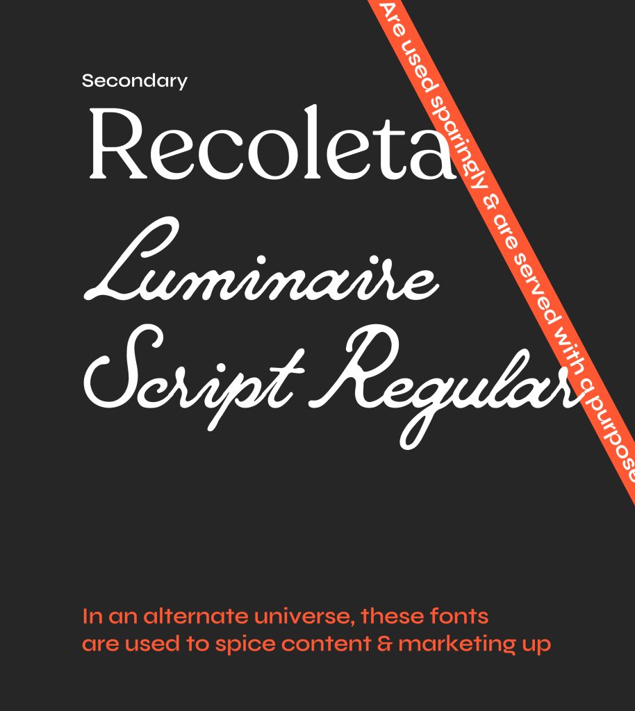
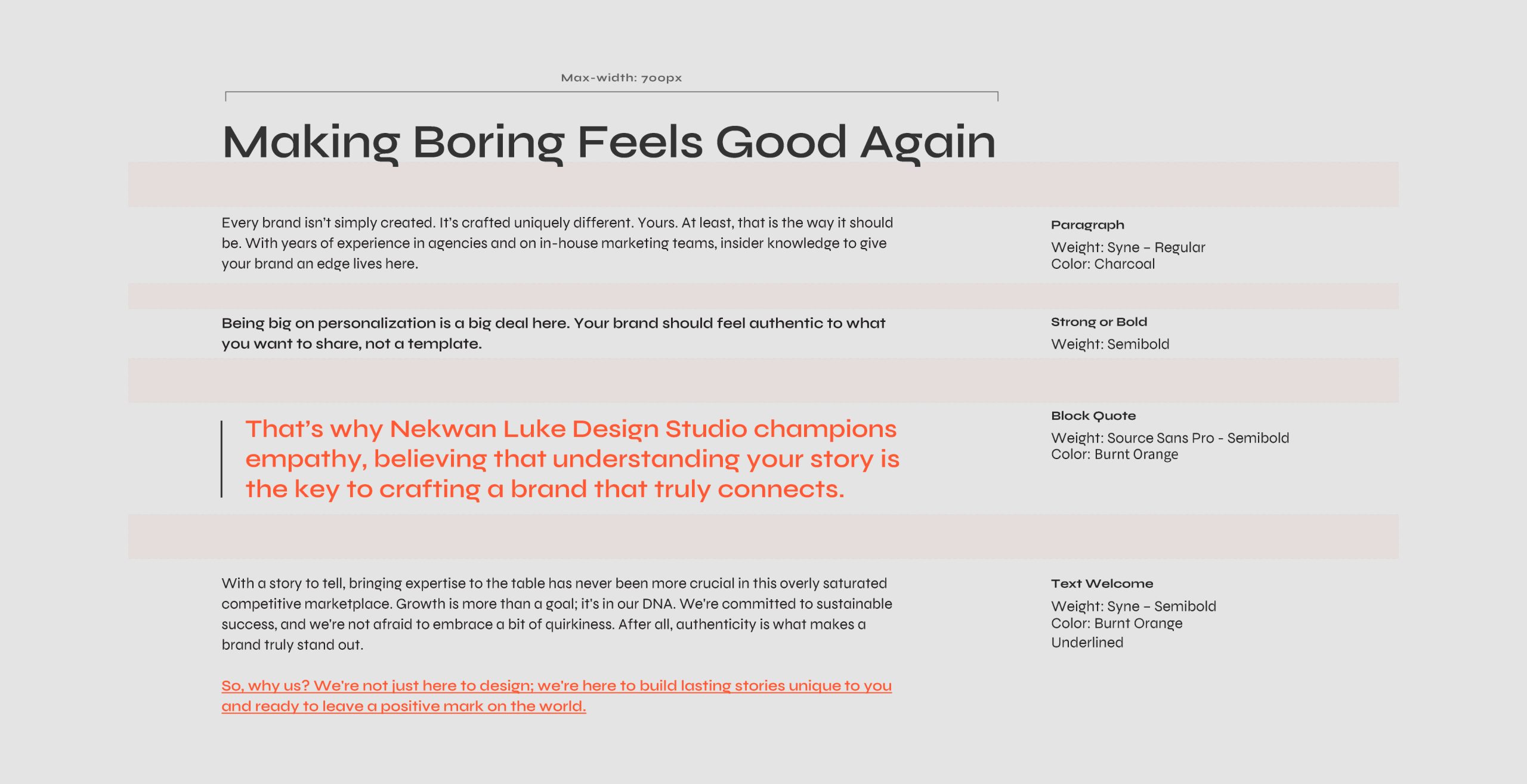
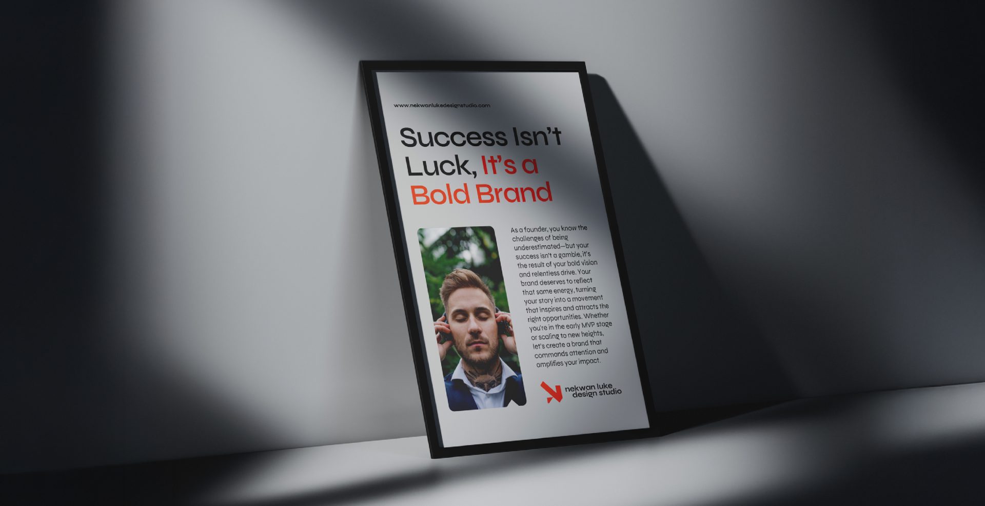
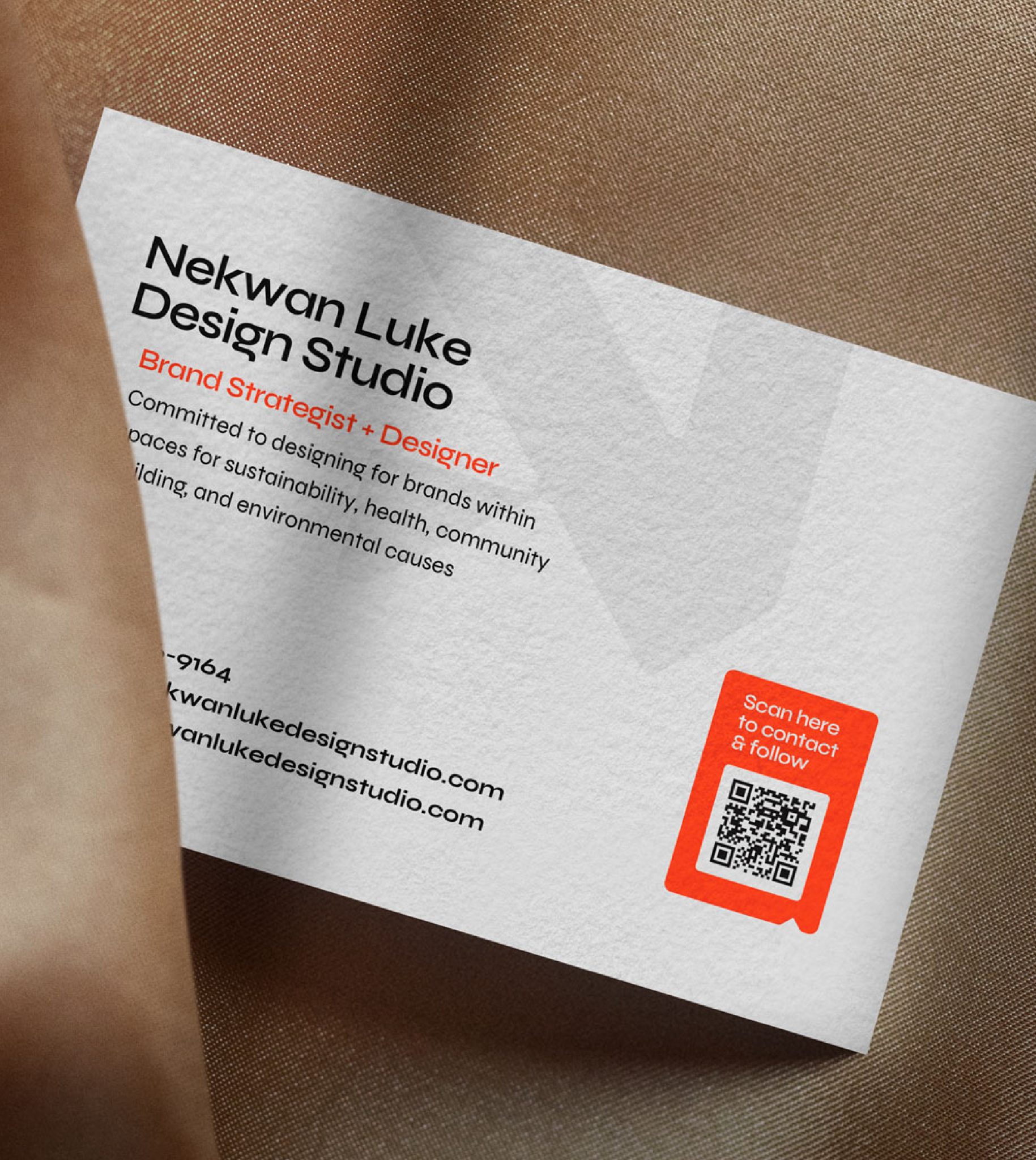
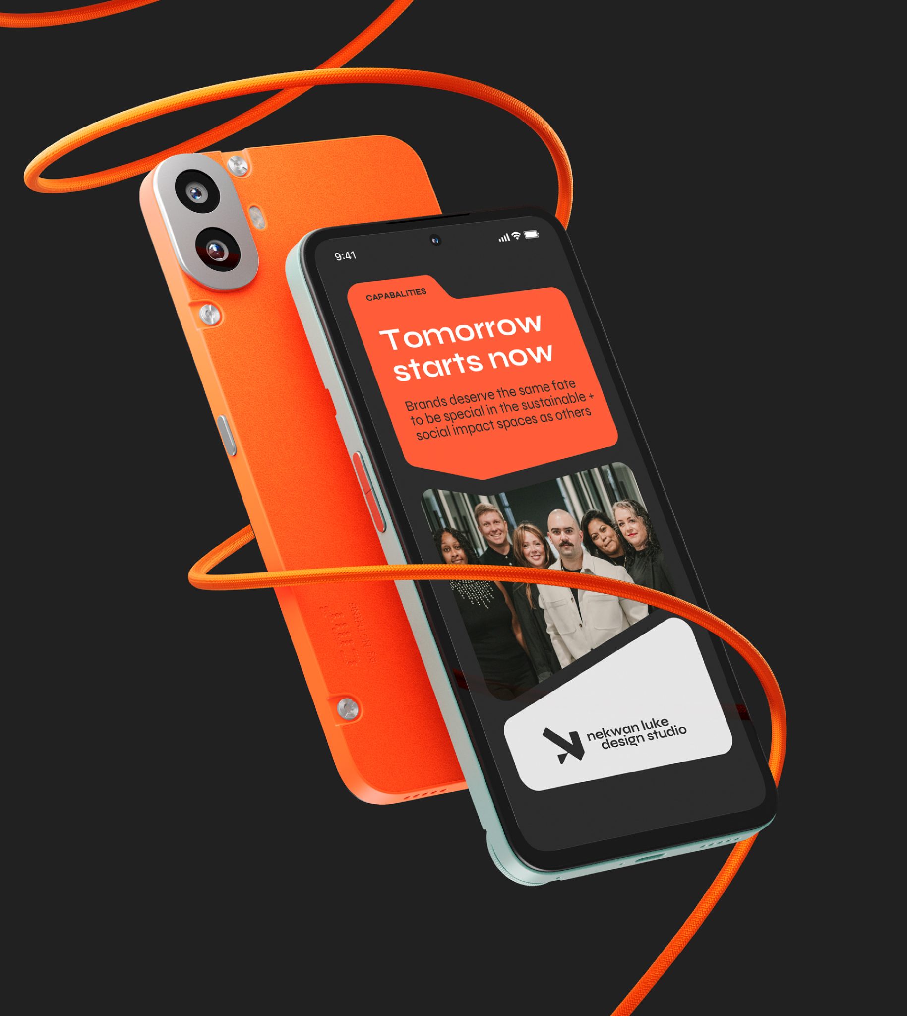
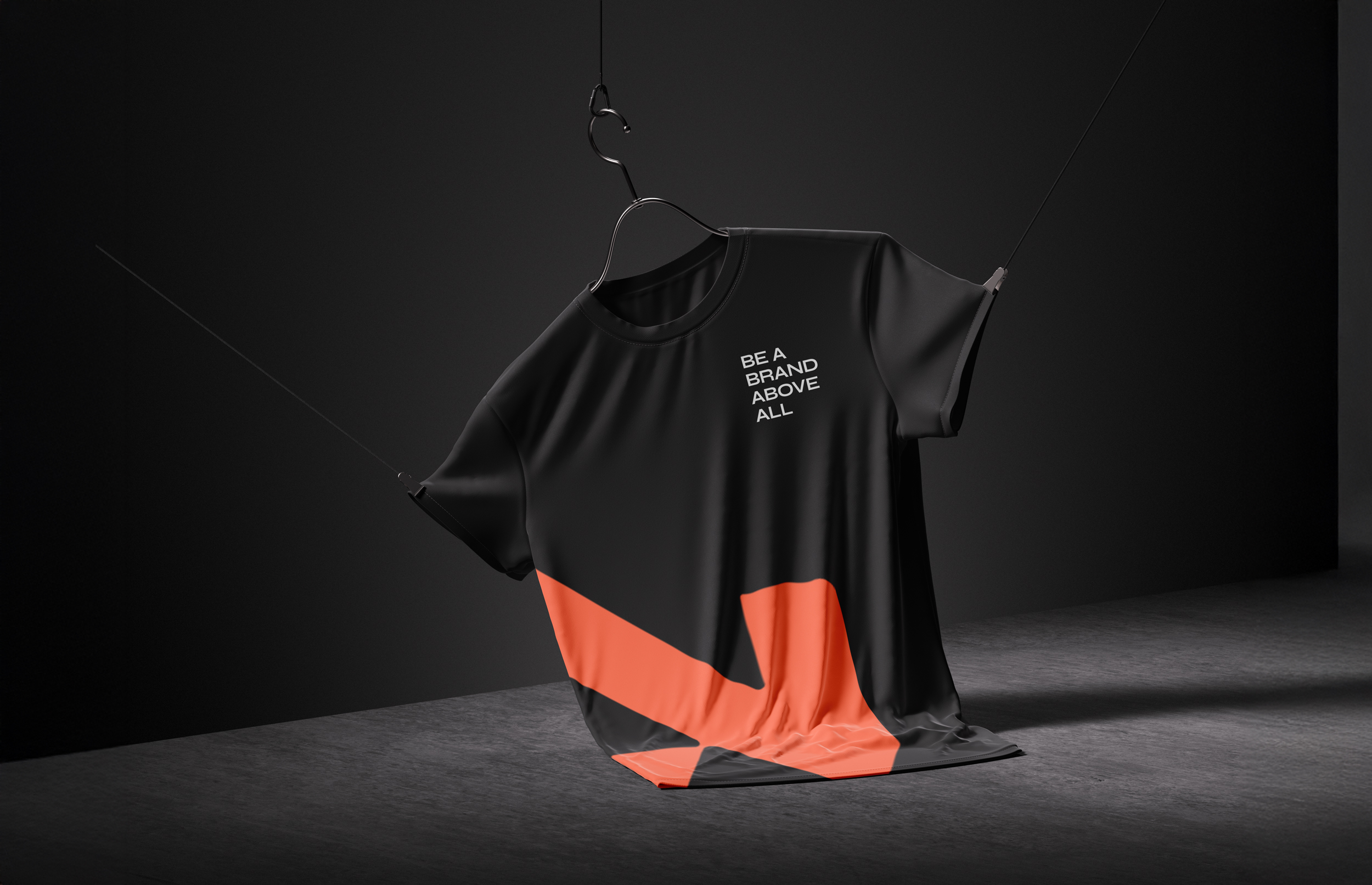
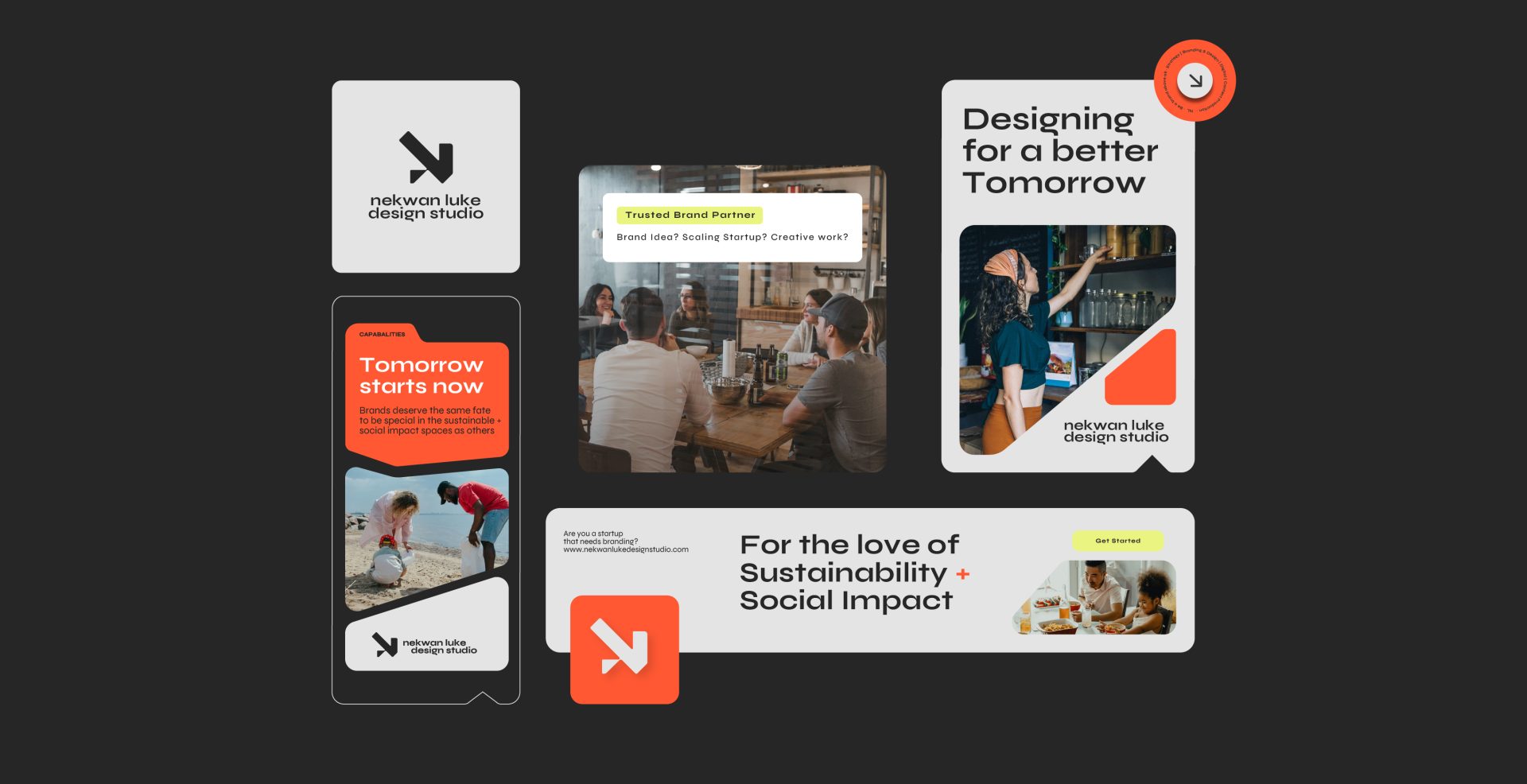
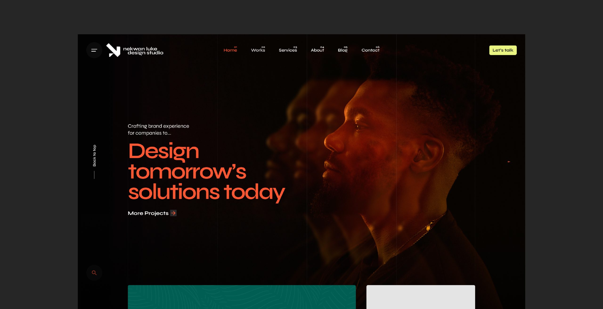
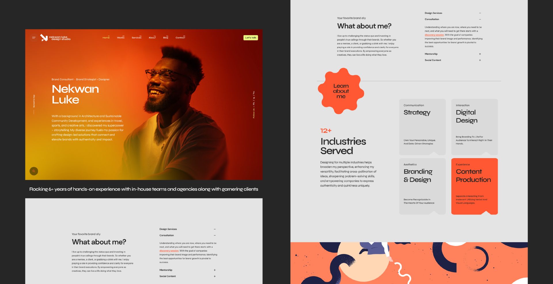
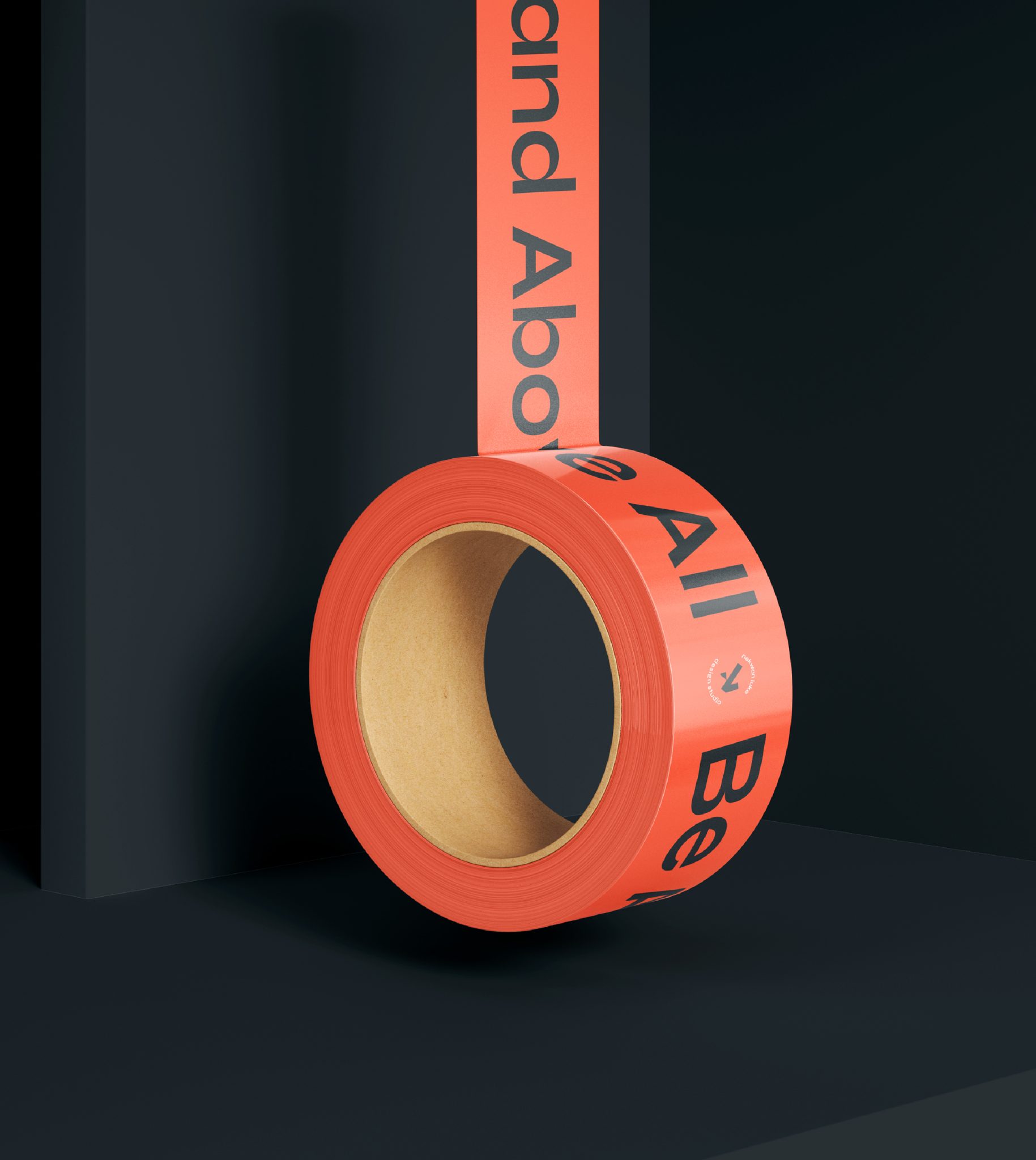
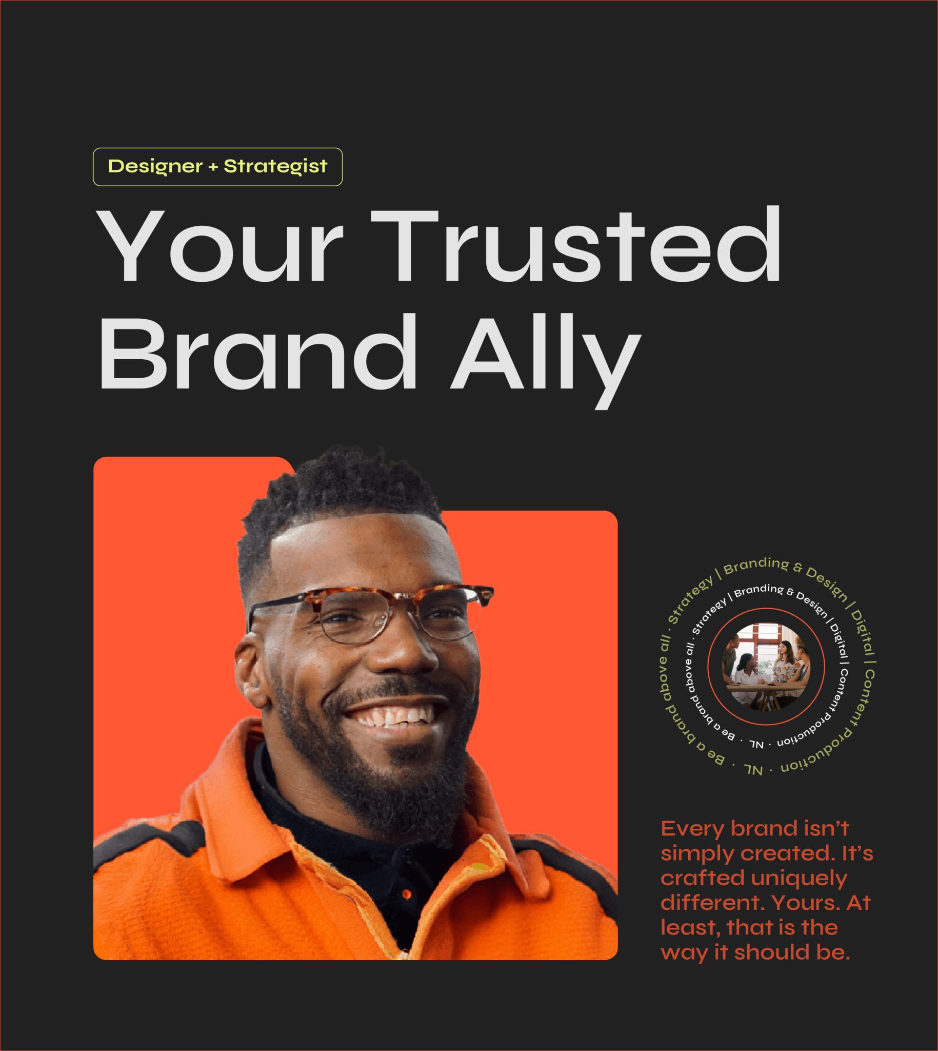
Rebranding Nekwan Luke Design Studio was a strategic endeavor aligning the identity with its commitment to storytelling, sustainability, and authenticity. As a one-man studio with aspirations of larger and aligned projects, this rebrand is intended to showcase the unique approach to crafting design-led solutions that foster meaningful connections and elevate brands. Guided by the tagline, “Be a Brand Above All,” this transformation emphasized personalization, empathy, and expertise.
Task
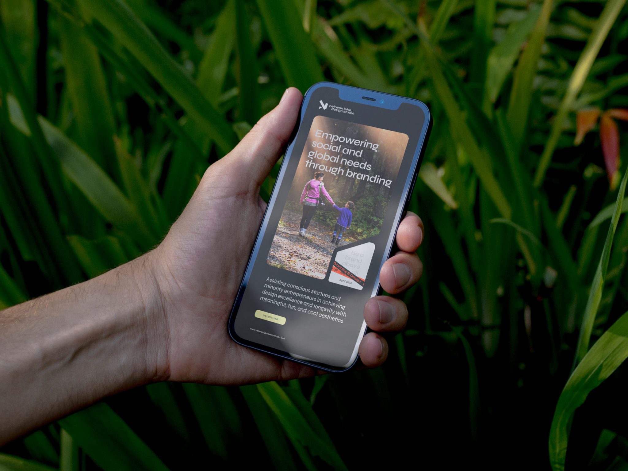
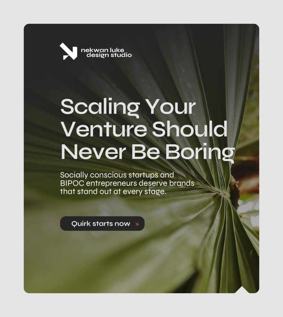
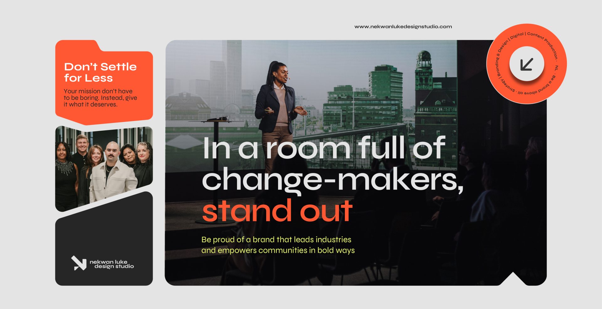
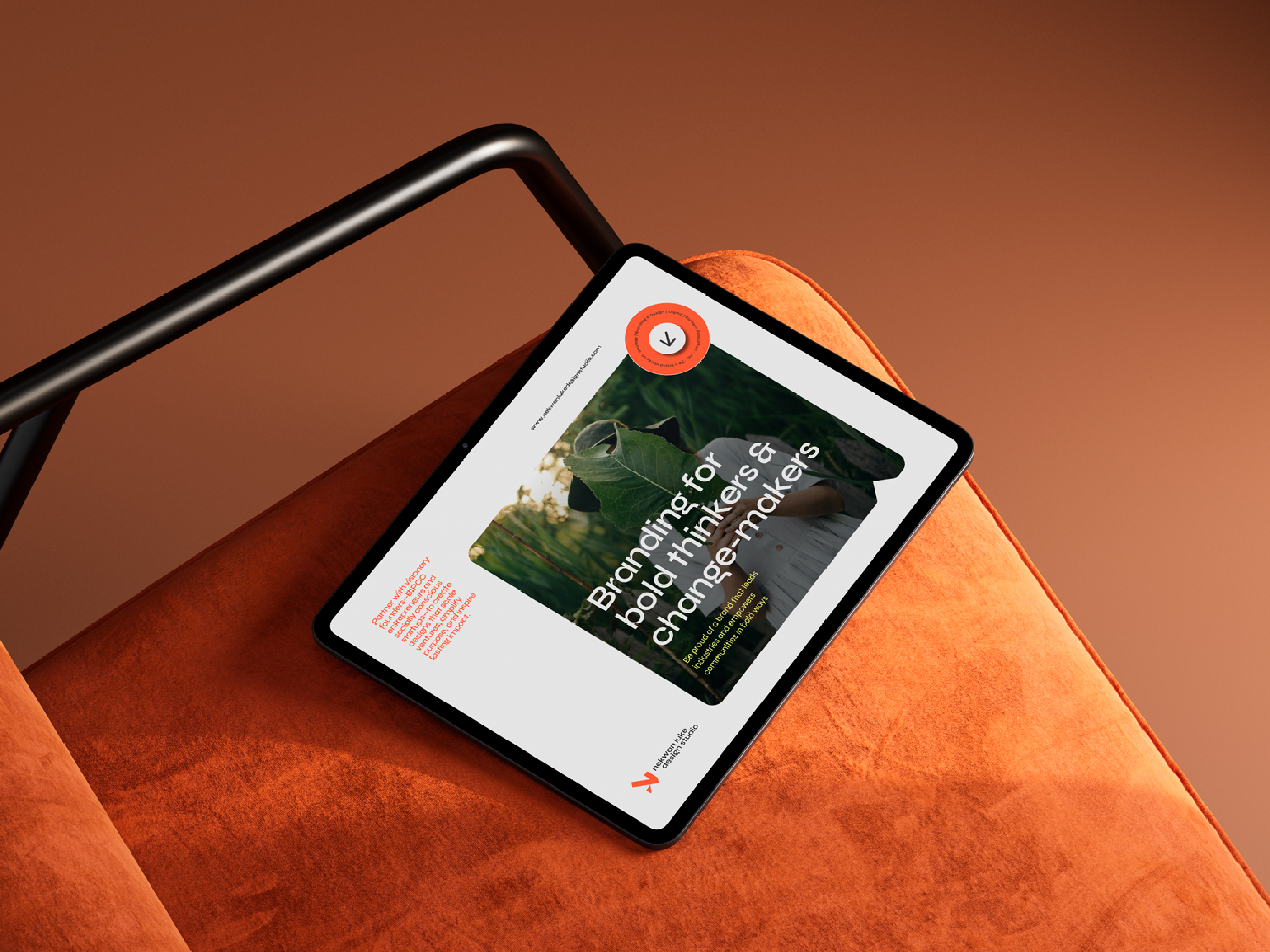
The task was to create a brand identity that speaks to BIPOC entrepreneurs and socially conscious startups seeking to use design as a catalyst for scaling their ventures, amplifying their purpose, and inspiring lasting impact. A scalable and impactful identity would be helpful to achieve its growth goals while meeting the high expectations of visionary clients.